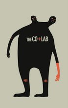
business card/clothing tags

So i came up with a final design for the business card and I like Milan's idea of using the business cards as tags for the shirts! Instead of putting holes, I was thinking maybe we could staple a knotted piece of hemp to the business cards and then use safety pins to attach to the shirts.
The image on the top of the front side is a photograph of two design magazines shuffled like cards. I once saw on TV an experiment on pulling apart two phonebooks that were inter-shuffled like this and it took 2 trucks, or 8 horses to take them apart--no, not pull them apart but break the two books apart because the bond was too strong. Kinda cool, eh?

1 comment:
Haemiiii,
That concept is totally appropriate for the co/lab- this would make a really great poster!
I think that since deciding that the card should serve both as the t-shirt tag and business card, I am thinking that it should be a bit more 'fun' and less serene. I know we hate the word 'fun' but by that i mean engaging and solid for a little standalone card. I get more of that feel from the red side than i do the front side. I think I would like to see colorful illustrations. Everyone, please feel free to disagree with me.
I also think that designing with a holepunch inconsideration can be interesting? Maybe stylize the hole, or make it part of the "o" in co/lab. or like, part of the logo somehow, which should also be included.
I only criticize because I want it to be just right. But that's my opinion and we should hear others too. What do you think Haemi?
Post a Comment