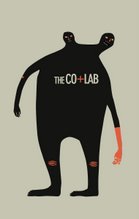
I really enjoy the texture given by overlaying the logo in the background. Very nice ideed! I also enjoy the hand written text on front and the way ColLab repeats, however....
I, being me, keep trying to figure out why some of the letters in the text were filled in more. Maybe it means something and I am just not smart enough to get it. Was there a point to it? Was it just to be pretty? I don't understand!
Also, I was having difficulty finding a focal point because of the black guys in the back. With such delicate yellow text and so much texture in the background, I kept looking to the black guys instead of the text.. maybe that was the point.
I'm only bashing on you because I know you are a million times better than me and you carried me through 154.

5 comments:
hahha that made me laugh. looks good ivan
i like it. good idea
haha it is a good idea. i love what you did with the bg - the colors are great too =]
HI Ivan!!!
Again, your safety, I worry.
I really enjoy the texture given by overlaying the logo in the background. Very nice ideed! I also enjoy the hand written text on front and the way ColLab repeats, however....
I, being me, keep trying to figure out why some of the letters in the text were filled in more. Maybe it means something and I am just not smart enough to get it. Was there a point to it? Was it just to be pretty? I don't understand!
Also, I was having difficulty finding a focal point because of the black guys in the back. With such delicate yellow text and so much texture in the background, I kept looking to the black guys instead of the text.. maybe that was the point.
I'm only bashing on you because I know you are a million times better than me and you carried me through 154.
Heart val!
haha.
i'm in a danh's-pattern-class phase right now and i'm trying to not be linear and logical and aligned.
in other words, i just whipped that poster up in 30 minutes.
Post a Comment