UPDATE T-shirt entry one (working image?)

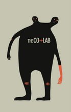
I'm not entirely sure about the placement of this on a shirt, but I thought I could get some feedback on this so far. It's three colors but could easily be changed to two.
![]()
I'm not entirely sure about the placement of this on a shirt, but I thought I could get some feedback on this so far. It's three colors but could easily be changed to two.
![]()
5 comments:
hmm, image error, SamSam?
ah, I can see! I love the little dudes, each have a different personality - (i wish more of them were smiling!) and i think it would make more sense if they were reaching for the logo, as opposed to having it below...I can see this towards the bottom of the shirt. Fabulous.
frickin' awesome.
that's awesomely "cute" - if i may use that term. haha. As to the placement, I think the placement of the guys works where it is. If it's placed at the bottom, the top guy might be reaching for somewhere.. where it shouldn't be reaching.. if a girl's wearing it >.>. aha.
Milan makes an interesting point about the placement of the logo - it makes sense, but at the sametime i do like it below the guys.
Another interesting aspect to maybe look into is if some of the guys in there were more personalized to be each member of the collab. Like milan talking to everyone, adam snapping pictures in people's faces. something of that sort - just a thought, but I like it as is as well =]
I really liked your poster tonight. And I like the placement on the shirt. It's not normal which is one of the more important aspects that sells me on t-shirt graphics.
Post a Comment